Published
Museums and websites: anticipating visitors’ needs
Curating the optimal reading experience for our research thesis
There are plenty of positives in coming up with a research thesis with 7,000 words spanning 30 pages but approachability is not one of them.
So when it came time to contact museums with our thesis, we quickly realized no one was gonna read anything that long — ain’t nobody got time for that. So, to help our prospects (and our friends), I built a digest.
In this article we are gonna go behind the scenes of some details of the website that I had a lot of fun building and that can be summed up pretty easily as: anticipating visitors’ needs and providing for them with user experience.
Exhibiting confidence
Would you let two beautiful designers enter your museum in the middle of the work day and dangle microphones in front of your employees? Me neither. And at first glance that may seem like the exact thing we were asking museums permission to build.
But the real idea is way simpler and more professional than that. We needed the vehicle carrying that message to convey that same simplicity and professionalism.
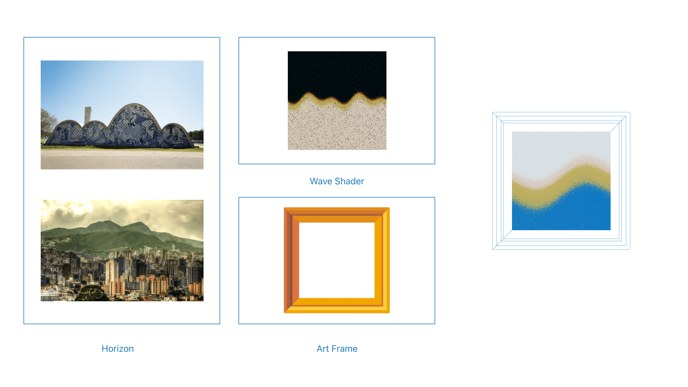
One of the easiest ways to prove to someone you are serious about something is through aesthetics. Having a defined color palette and a simple icon can go miles for helping to cement an idea into people’s brains.
Our research icon uses a couple of visual metaphors to tell what our research is and at what level we are operating: a museum frame (for, well, museums) exhibiting mountains (symbol of the city we are researching in) with an upgraded look provided by .
Offering the right content
Every time we open a blog post, article or essay on our devices, instantly, our need to understand that content starts fighting with our need to get something else done. That’s why the best editing tool in the world has always been and will always be: cutting.
To come up with the right content for this website, I sat down with the 30-page document we handed to the examination board in one hand and a red pen in the other. I was determined to cross out everything I wouldn’t tell a person in a casual conversation about the project. The goal here was to come up with content someone would read, and understand, while waiting for their plate to arrive at a restaurant table.
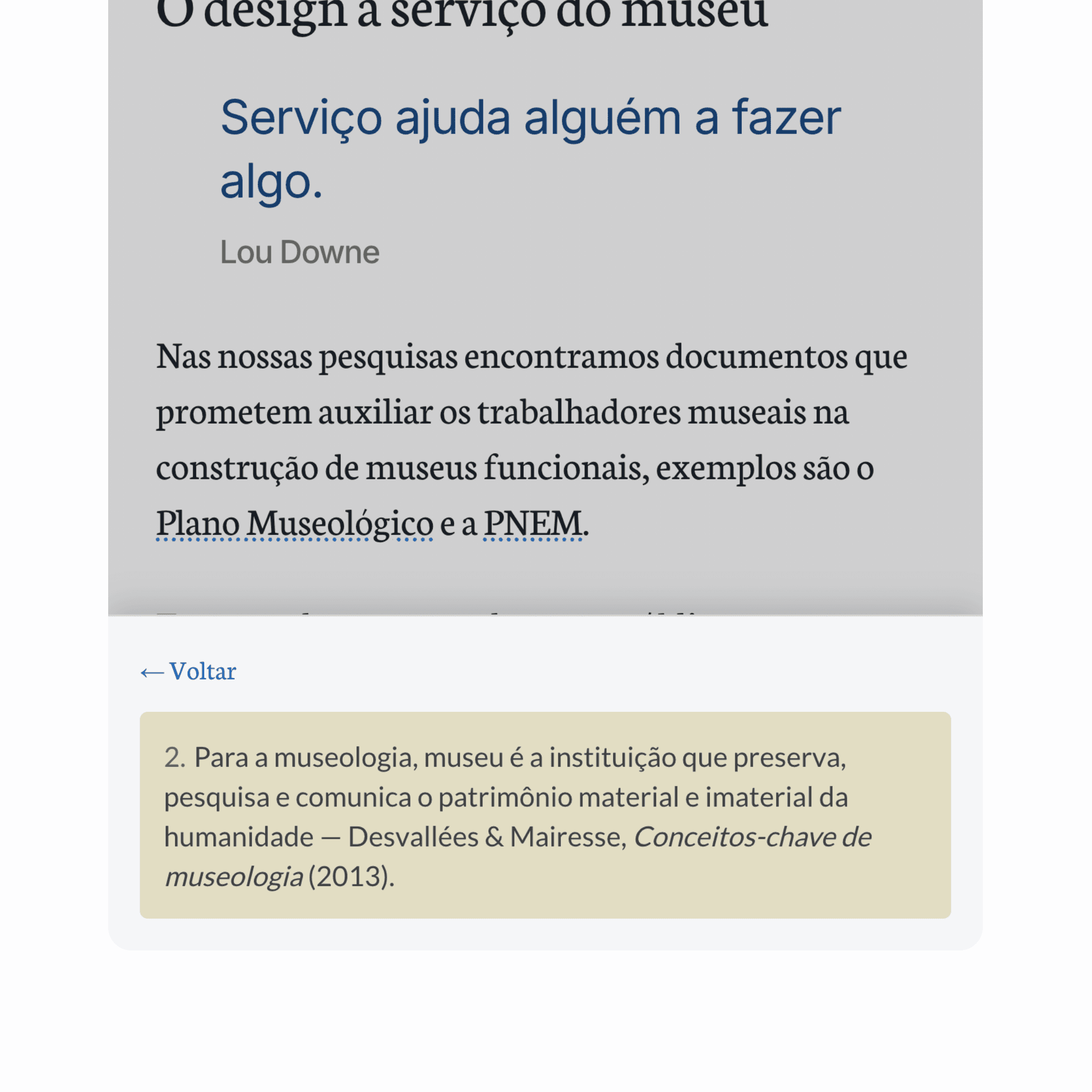
None of the cuts were made with the assumption that something was too complicated for a layman to understand. To put it more bluntly, the idea was never to “dumb it down”. Every time we felt the need to provide further explanations, a glossary and some sidenotes were introduced to aid in understanding.
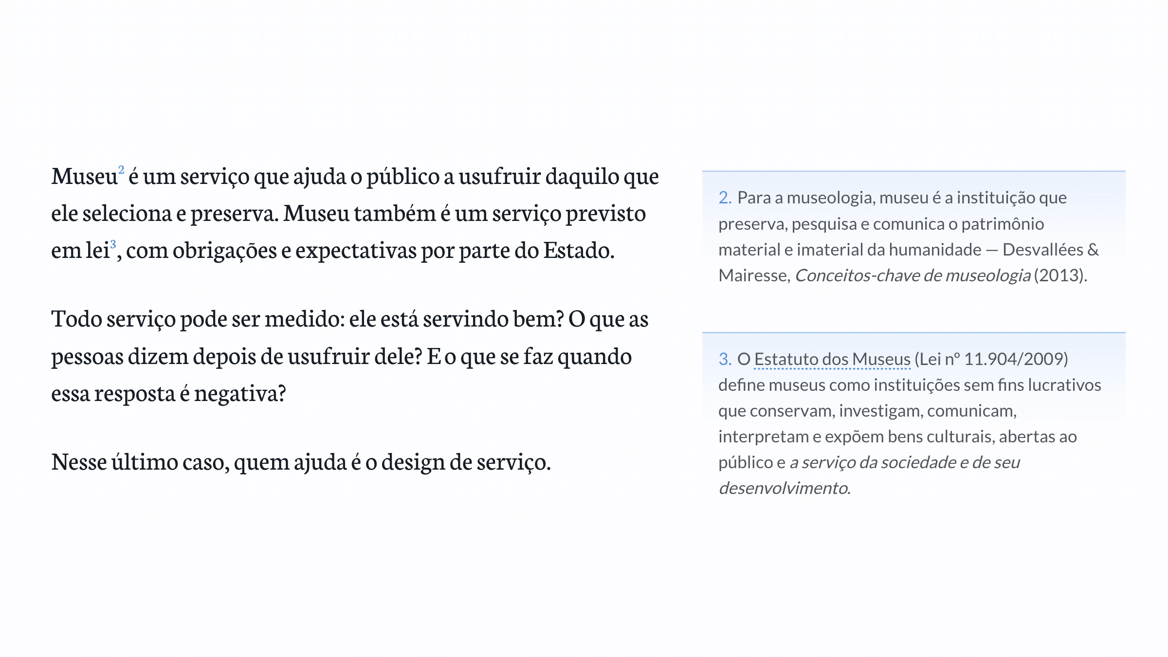
We made sure all these interactions would still work on mobile without breaking visitors’ reading flow by using Vaul, by Emil Kowalski.
Reiterating that you’re welcome
Regardless of how you landed on the reach out section, there is one thing that can stop you from actually making the move to contact us: not knowing if you really match our filter. It can be confusing to understand what museum profile we are actively looking for, whether you’re welcome at the party.
To end that doubt we added a search mechanism. It uses a fuzzy search method that updates at every keystroke.
Being a fuzzy search means we get “CCBB” out of “Centro Cultural do Banco do Brasil” without having to index all the variants of the museum in the list. Updating at every keystroke only works here because the list has dozens of museums, but not hundreds or thousands, so the constant update doesn’t cost us much.
This ends up being helpful for both the visitors and our inboxes: if you are not part of the research filter, we tell you right away instead of wasting your time and our space with dead-end messages.
Because we got our list of museums from open data provided by the government, there is always the risk of inclusions in the database being delayed or faulty. If the person is sure the museum can be a fit even if they don’t find themselves on the list, they get an alternate route to talk to us.
To design is to curate
To write this piece I used an agent to summarize the whole history of my git commits as a story. The agent said: subtraction was the main activity.
The website was the largest around July 31 and from then on it only got smaller. Plenty of data visualizations were cut, bonus routes didn’t see the light of day and the most stark of all: the 7,000 words of the academic document came down to 1,739 in the first pass, and to roughly 500 in the end.
In the episode of the Rework Podcast from 37signals, Jason Fried says:
A good museum doesn’t just throw everything in its collection up on the walls. There is a curation process. Someone says, ‘no’. It’s in making these edits that the real product comes out, so embrace it.
And I say now, a good website doesn’t just throw everything in its repository history up on production. There is a curation process. It would have been all too easy to simply style the entirety of the academic document and put it on display, but that’s not design.
Design involves deletions and difficult choices made in favor of the visitor we are welcoming, based on what we understand to be their needs. Good museums and good websites alike curate for the needs of their visitors.

